Built a multi-page Power BI dashboard to rate and track 100+ suppliers across six performance dimensions — replacing vague, unverifiable scoring with live, data-backed visibility from board level to operations.
Industry
Manufacturing / Procurement
Duration
4 Months
Role
Solo — Design & Build
Year
2023
2–3
Days of manual consolidation eliminated per supplier incident
100+
Suppliers rated across 6 dimensions in real time
92
Vendors and counting — down from 100+ toward strategic target of 70
The Problem
The company had no structured supplier performance system. When issues arose with a vendor, data had to be pulled and consolidated on demand — a reactive process that took 2–3 days per supplier. With 100+ active vendors and no continuous monitoring, problems often escalated before anyone had a clear picture.
Scores that were given to vendors were vague and unanchored to real data. They couldn't be traced back to a source, couldn't be proven, and in some cases the underlying data simply didn't exist. OTIF issues were missed. Decisions on which suppliers to grow or cut were being made on gut feel rather than evidence.
"This dashboard will help to achieve our target of reducing suppliers from 100+ to 70, aligning with our future strategy of working with very good, reliable suppliers."
Director
My Approach
I spent the first phase defining a performance framework that could replace subjective scoring with measurable, data-backed ratings. Six dimensions were identified as the core of supplier health: OTIF, Quality, Communication & Collaboration, Pricing, Value Added to the company, and Industry 4.0 Readiness.
Designed a Bronze / Silver / Gold tiering model driven by composite dimension scores
Built the data foundation on SharePoint Lists — accessible across departments, no specialist tooling needed
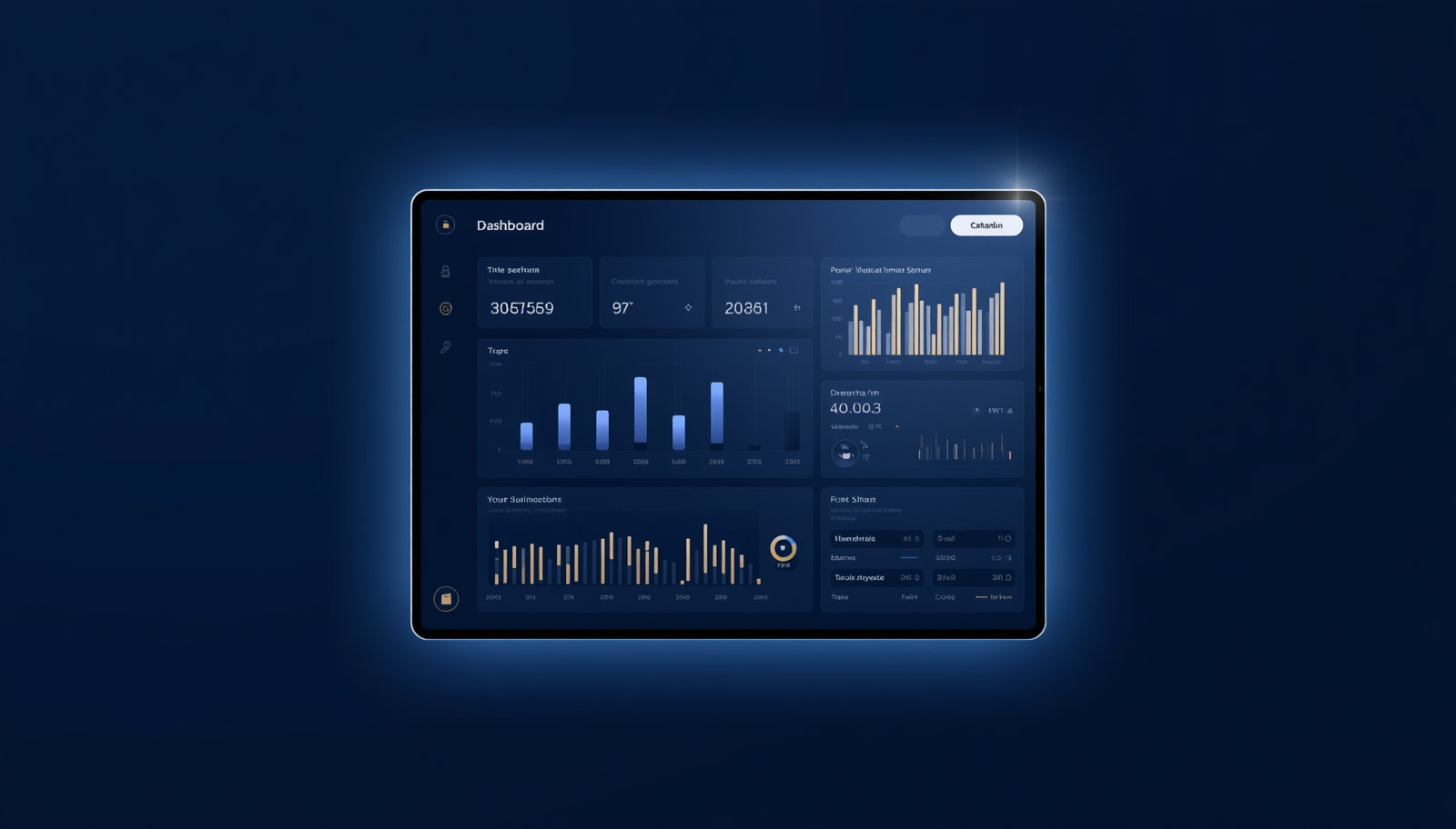
Structured a multi-page Power BI dashboard: spider/radar overview, zero tolerance flags, and a detailed communication layer
Ran evaluation cycles over 4 months to validate scoring logic before full deployment
The Build
The dashboard was structured across three pages. The main overview used a spider/radar chart to visualise each vendor's rating across all six dimensions at a glance — making it immediately obvious where a supplier was strong or failing. A separate zero tolerance page surfaced any vendor breaching non-negotiable thresholds that required immediate action.
The third page was the Communication & Collaboration detail view — vendors were ranked by input from all departments, and each department could log scores and comments directly within the tool. This turned the dashboard into a two-way channel: internal teams could communicate with suppliers through the platform rather than via scattered emails.
The Industry 4.0 dimension tracked manufacturing capability: 3D design, SMV calculation, Auto Spreader, Auto Cutter, in-line automation, ESG integration, Laser Cutting, and Mini Marker capabilities. This gave procurement a forward-looking lens on which suppliers were investing in modernisation — not just current performance.
Data refresh was designed to be flexible: automatic on new vendor entry, seasonal scheduled refresh aligned to procurement cycles, and manual trigger available at any time.
The Result
For the first time, performance data on all 100+ suppliers was visible simultaneously — from board level to operations managers — without any manual consolidation. The reactive 2–3 day scramble per supplier was replaced by always-on visibility.
Manual consolidation time: 2–3 days per supplier incident → 0
Decision support: board to managers now aligned on single source of truth
Strategic impact: vendor base actively rationalising from 100+ toward target of 70 (currently at 92)
Business volume decisions — increases and decreases — now directly tied to tier movements (e.g. quality drop to Bronze triggered reallocation of complex styles to a Gold-tier supplier)
What I'd Do Differently
The data foundation on SharePoint Lists served the immediate need, but the better long-term architecture would have been Microsoft Dataverse. Dataverse can pull directly from enterprise sources like SAP and existing business warehouse databases — eliminating the manual data entry layer entirely and making the model scalable as the supplier base and data complexity grow. If rebuilding today, that would be the starting point.
Tools Used
Power BI
SharePoint Lists
Power Query
DAX
Procurement Analytics
Project Details
Timeline
4 months
Suppliers tracked
100+
Dashboard pages
3
Rating dimensions
6
Refresh
Auto + Seasonal + Manual
Need Something Similar?
I build data dashboards for procurement, operations, and sales teams. Start with a free process audit.