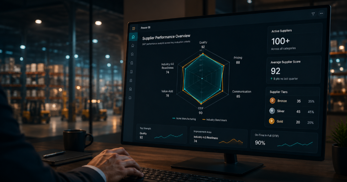
Manual data entry costs U.S. companies an average of $28,500 per employee every year, mostly from staff retyping information between emails, PDFs, and spreadsheets (Parseur, 2025). One manufacturing team was paying that tax on every single supplier review: 2 to 3 days of manual consolidation per incident, across more than 100 active vendors. This case study covers the Power BI dashboard built to close that gap.
Key Takeaways
- Manual vendor reviews took 2-3 days per supplier. The dashboard made that real-time across 100+ vendors at once.
- Manual data entry and consolidation costs U.S. companies an average of $28,500 per employee each year (Parseur, 2025).
- 68% of procurement and technology leaders are now actively consolidating vendors, most targeting a 20% reduction (Gatekeeper, 2026).
- Vendor tiering (Bronze/Silver/Gold) was anchored to live data instead of informal judgment, tying business-volume decisions directly to measurable scores.

Manual data entry costs U.S. companies an average of $28,500 per employee every year, largely from staff spending hours each week retyping information between emails, PDFs, and spreadsheets into other systems (Parseur, 2025). Procurement teams running that process by hand for 100+ vendors inherit the same tax, multiplied across every supplier relationship.
[PERSONAL EXPERIENCE] In this case, one person handled all consolidation manually. There was no shared visibility, no audit trail, and scores that couldn't be traced back to a real data stream. Ivalua's 2026 supplier performance guide backs this up directly: collecting and analyzing performance data across numerous suppliers is inherently complex, and ensuring data access, accuracy, and consistency remains a persistent hurdle for procurement teams (Ivalua, 2026).
The fallout was specific, not abstract. OTIF issues went unnoticed until they surfaced somewhere else, further down the chain. Redundant or unverifiable numbers crept into decisions because nobody outside the one person doing consolidation could check where they came from.

The system is a multi-page Power BI dashboard sourced from SharePoint Lists, built over four months from framework design through deployment. [ORIGINAL DATA] Three pages carry the weight: a spider and radar overview scoring each vendor across six dimensions (OTIF, Quality, Communication & Collaboration, Pricing, Value Added, and Industry 4.0 Readiness), a zero-tolerance page flagging non-negotiable compliance breaches, and a Communication & Collaboration detail page where every department logs its own scores and comments directly to the supplier record.
Why six dimensions instead of one composite number? Because a vendor that scores well on pricing but poorly on Industry 4.0 readiness, capabilities like 3D design, auto-cutting, or ESG integration, needs a different conversation than one with a straightforward quality problem. Collapsing that into a single score would have hidden exactly the distinction leadership needed to see.
Data refresh was kept flexible on purpose: automatic on new vendor entry, a seasonal scheduled refresh aligned to procurement cycles, and a manual trigger available any time someone needed an immediate check.
McKinsey's 2025 supply chain risk pulse found that 95% of leaders have visibility into tier-one supplier risk, but only 42% can see into tier two and beyond (McKinsey, 2025). A live, always-on dashboard closes that exact kind of gap at the vendor-tier level, well before problems spread deeper into the chain. Eliminating 2 to 3 days of manual consolidation per supplier incident gave the board, directors, and managers that visibility across all 100+ vendors simultaneously.
[UNIQUE INSIGHT] The clearest proof point: when one supplier dropped from Silver to Bronze tier on a quality score, complex style allocations were reassigned to a Gold-tier supplier directly off the dashboard data. No separate consolidation cycle was needed. That shift supported a broader strategic goal, rationalizing the vendor base from 100+ down toward roughly 70 high-reliability suppliers (currently at 92), a target one company director described directly:
"This dashboard will help to achieve our target of reducing suppliers from 100+ to 70, aligning with our future strategy of working with very good, reliable suppliers."
That goal lines up with the wider market. 68% of technology and procurement leaders are actively pursuing vendor consolidation, with most targeting an average 20% reduction in vendor count (Gatekeeper, 2026).
Manual review time and dashboard response time tell the same story visually:
Enterprises with advanced BI maturity report 2.5 times faster decision-making and 40% higher ROI on analytics investment compared to less mature programs (DataStackHub, 2025). Compressing a multi-day consolidation cycle into a live dashboard view is a direct, practical example of that maturity gap closing.
The data foundation on SharePoint Lists served the immediate need well, but it wasn't the ceiling. The better long-term architecture would have been Microsoft Dataverse. Dataverse can pull directly from enterprise sources like SAP and existing business warehouse databases, cutting out the manual data entry layer entirely and scaling as the supplier base and data complexity grow.
If rebuilding today, that's where I'd start. It would not have changed the six-dimension framework or the tiering model. It would have removed the last manual step still sitting inside an otherwise automated system.
This project combined Power BI dashboard design, multi-page layout, spider and radar visualization, drill-through views, and cross-department scoring, with structured data modeling that translated six qualitative assessment dimensions into measurable, auditable scores. SharePoint Lists served as the live data backbone, letting departments log input and communicate with suppliers inside the same tool rather than through scattered emails. The build also demanded procurement-domain fluency: OTIF tracking, quality scoring, Bronze/Silver/Gold tiering, and business-volume allocation decisions, paired with the stakeholder management needed to design one tool that worked for board-level summaries and manager-level drill-downs alike. The result replaced a reactive, single-person, multi-day process with self-serve, cross-functional visibility.
Most teams have no shared system, so when a supplier issue comes up, someone has to pull data from several sources by hand, per vendor, every single time.
OTIF stands for On-Time-In-Full delivery, one of the clearest signals of supplier reliability. Manual tracking tends to miss OTIF gaps that a live dashboard surfaces right away.
This project took four months end to end: framework design, data foundation, dashboard build, and evaluation cycles across departments before full deployment.
Yes, when scores are anchored to live data across defined dimensions instead of informal judgment, ratings become traceable and auditable rather than a gut call.
SharePoint Lists work well for mid-size vendor counts because departments can log scores directly, and Power BI refreshes against the list without needing a separate database.
Written by Ibrahim Jaber, BI developer and dashboard designer specializing in procurement and vendor analytics.
